Saturday, 28 January 2012

When Joanne made her first Photoshop document...

For the type part of my project, I made another set of stencils with a more curved type. I found stencils were a great medium to use because they naturally move and could be easily shaped to portray the word, bubbly.

 This was a selection of typography that I gathered over the past two weeks. It helps to be aware of the different typography in our world for visual communications. Some of the typography here was from packaging, something we regularly take for granted.
 I continued to do more thumbnail sketches because they really helped to show my ideas clearly and help produce more ideas again.
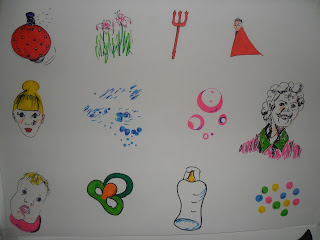
 I researched the word 'personality' and found out similar meanings were a person's complexion/identity/make-up. From here, I came up with the idea of what a bubbly girl's personality would have in her handbag.

My second illustration idea was to do with party streamers which make up the lady's body and clothes. The idea of streamers came from celebrations because while brain storming, I thought a bubbly personality would like parties, discos, dancing etc. I also divulged with the idea of using an elderly person or a young girl/baby to describe the metaphor in my illustration but later I realised maybe a person only needs to be represented by something or things.


Patricia, my tutor, encouraged me to give photoshop a chance. I improved my skills and really enjoyed designing an illustration for 'her bubbly personality' on photoshop. I used images of what a girl may have in her handbag and inserted them in the bubbles of bubble wrap. It was loads of fun and a very fulfilling experience. We also did some contextual research and I learned about typographers and illustrators.  I learned lots during my two weeks of vis com and I was disappointed to see it end. However, its onwards and upwards and onto my next elective...FASHION!!!

Monday, 23 January 2012

Visual Communications Elective

I am doing a new project in visual communications with a brief about metaphors and their meanings. The first week of the elective was dedicated to typography and the second week is all about illustration! Each of us were supplied with a different metaphor. My metaphor is, 'her bubbly personality', so there is lots of options and fun to be enjoyed!! With talks about lateral thinking taken on board, I realised that not everything should be taken literally and sometimes in fact, the exact opposite. Typography has all to do with different types of lettering. The first part of the brief was to portray the metaphor through a suitable type of lettering. I researched typographers and tried lots of different ideas...


We learned about serif and sans serif, roman and italic types of lettering in a lecture with Mary.


 Glue with a Fairy liquid background.

 
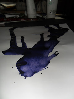
Results of stencils and ink drops.

 Paint


 I worked with the lateral thinking, that even though someone may be happy and bubbly, something sharp could easily burst their bubble.


Results of masking tape and ink producing a grafitti look.

At the end of the first week, each student presented their ideas for a crit with our tutors, Patricia and Mary.
I spelt out the word in bubble gum.

I also used shaving gel for a different effect.
While presenting my ideas, Patricia spotted the photos of my stencil making... The photographs capture the typography before the bubbles pop. It is far more intriguing at this stage than when the stencil is removed. I may use this kind of typography for my final piece taking aspects such as composition and size from other pieces.
I have started my illustration ideas this week. I did a mind map for illustration and some thumbnail sketches. Although these are simple and good to show what happens in my mind, they somewhat challenged me because I hadn't done a page of thumbnail sketches before. 


I am really enjoying the graphics elective and look forward to posting my finished typography and more illustration ideas for 'her bubbly personality'!!

Monday, 9 January 2012


This is a photo of what I described in a previous blog entitled 'More Colours'. I hope you all enjoyed my blogs on my project, Movement and Motion, because my assessment is looming! Thanks for taking the time to look at my work. I can't wait to get started on the discipline work so hopefully there will be more blogs :)

Friday, 6 January 2012

Sketchbook Moments

I was reflecting on the Movement and Motion Project today and thought the best way to go about writing a statement to describe my work was to look at my concepts in my sketchbooks and how my work became a sequential progression. I only ever blogged my bigger pieces of work so here is a look at some of the bits in my sketchbook...


Wednesday, 4 January 2012

More colours..

I divulged into some yellows and greens before the Christmas break. The colour ideas came from some differently toned photocopies I had been working with of my paper sculptures. I created a piece with these colours with the properties of a print where a certain colour of cardboard had to remain behind each sheet of cardboard because I cut out a design from not just one sheet of cardboard but five. I painted the five sheets a different variation of yellow until it was strong enough to develop into green. This idea originated from the thoughts of an artist, Terry Frost, who studied colours in serious depth. There is clear movement through the different coloured layers because I decided to maintain the white substance when I cut the card to reveal the design. The design is from the stretched paper sculptures. It resulted as being quite an interactive piece because there was an element of desire to play with the shapes in the design and rearrange the colours.

The design and preparation: